Hey, thought leaders! I want to tell you about a powerful approach to thought leadership…
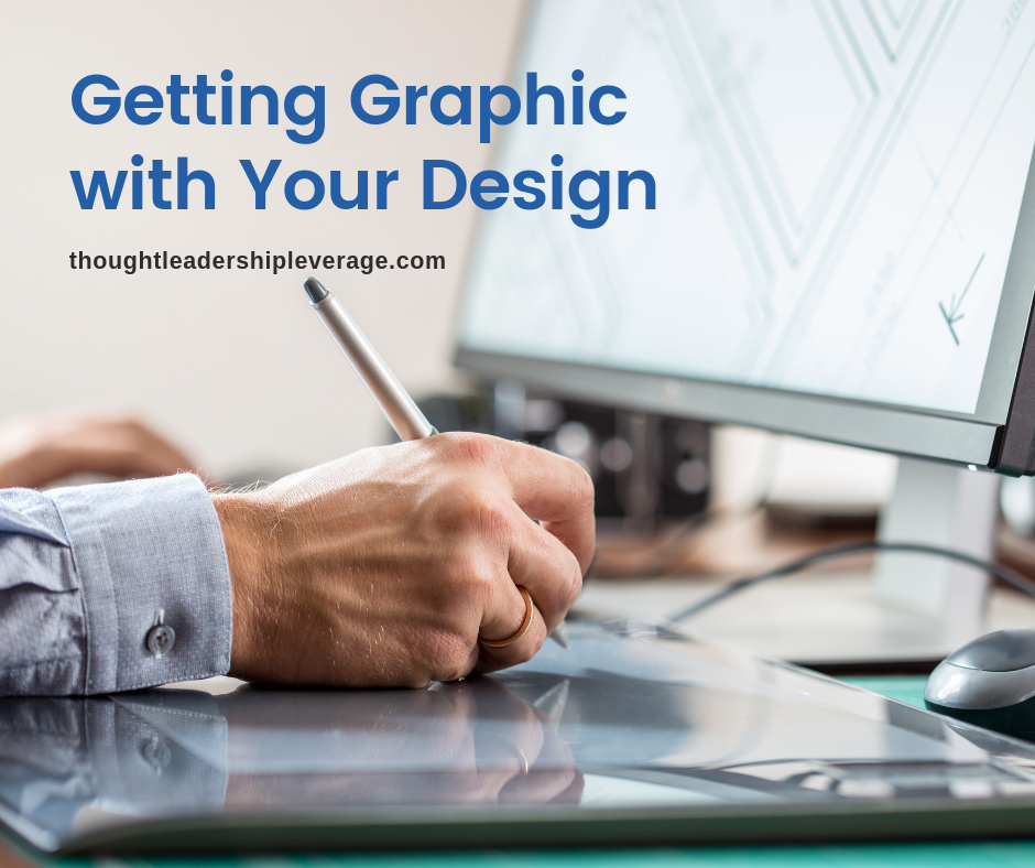
Getting Graphic with Your Design
As a thought leader, you may be great at telling stories through a presentation deck, using software such as PowerPoint, Keynote, InDesign, or Prezi. But unless you have studied graphic composition, it’s unlikely that you can build a really eye-catching deck to support your keynote speech or client presentation.
You have great ideas about leadership, be honest, but are you as brilliant with visual design?
In the world of thought leadership, it used to be that content was king and look-and-feel was secondary. But, in today’s global market, good visual branding and design isn’t just nice, it’s a requirement. All too often, we see that thought leaders have under-invested in their brands, letting their graphics and presentation become stale and dated. Unfortunately for your content, buyers and learners lose interest when they see poor graphic design, and that can mean the difference between a sale and a “pass.”

Good branding is an ongoing process.
When a thought leader updates their brand’s visual design, you want to increase your appeal, but you also want to keep the continuity of previous success. Think of it as a journey, one where you want your customers to follow along.
Think about the way you interface with UI/UX every single day. We use it on our smartphones, our computers, our tablets. We are naturally drawn to a high level of quality. Some thought leaders grab clipart and, without any graphics training, throw a deck together. They say, “I’m good enough with PowerPoint. I can make this work.” Their presentations usually have issues in branding, style, kerning – all the things a professional graphic designer would have avoided from the start.
Thirty years ago, graphic design required specialized software and hard-to-acquire tools. Now, it’s easy to get the tools, even if we don’t have the skill to use them. Yet, out of stubbornness and hubris, we create websites and presentation decks that constitute, “Crimes against Audience Sensibilities.” Just because you have the technology doesn’t mean you have the training or the talent to use it well.
Get over it.
Step away from PowerPoint and put down that crazy font. Instead, find a good graphic designer, and let that person do what they do best. You need great – not just “good” – visual design if you are going to present a unique, catchy, and professional brand for your content. One that will attract clients, and not give them the impression you don’t know what you’re doing.
Enterprise buyers expect a high-quality look-and-feel, but you also want to be proportionate in your investment. It’s possible to invest an endless stream of dollars in visual design without creating a single additional sale. So, be thoughtful, and make sure each design is sharp, clear, and evergreen.


